Packaging redesign for Stérimar
PACKAGING DESIGN
We won a competition!
A l’occasion d’une compétition d’agences, Sign & Volume a été choisie pour réaliser la refonte totale de la gamme Stérimar™ !

Evolution of the iconic logo
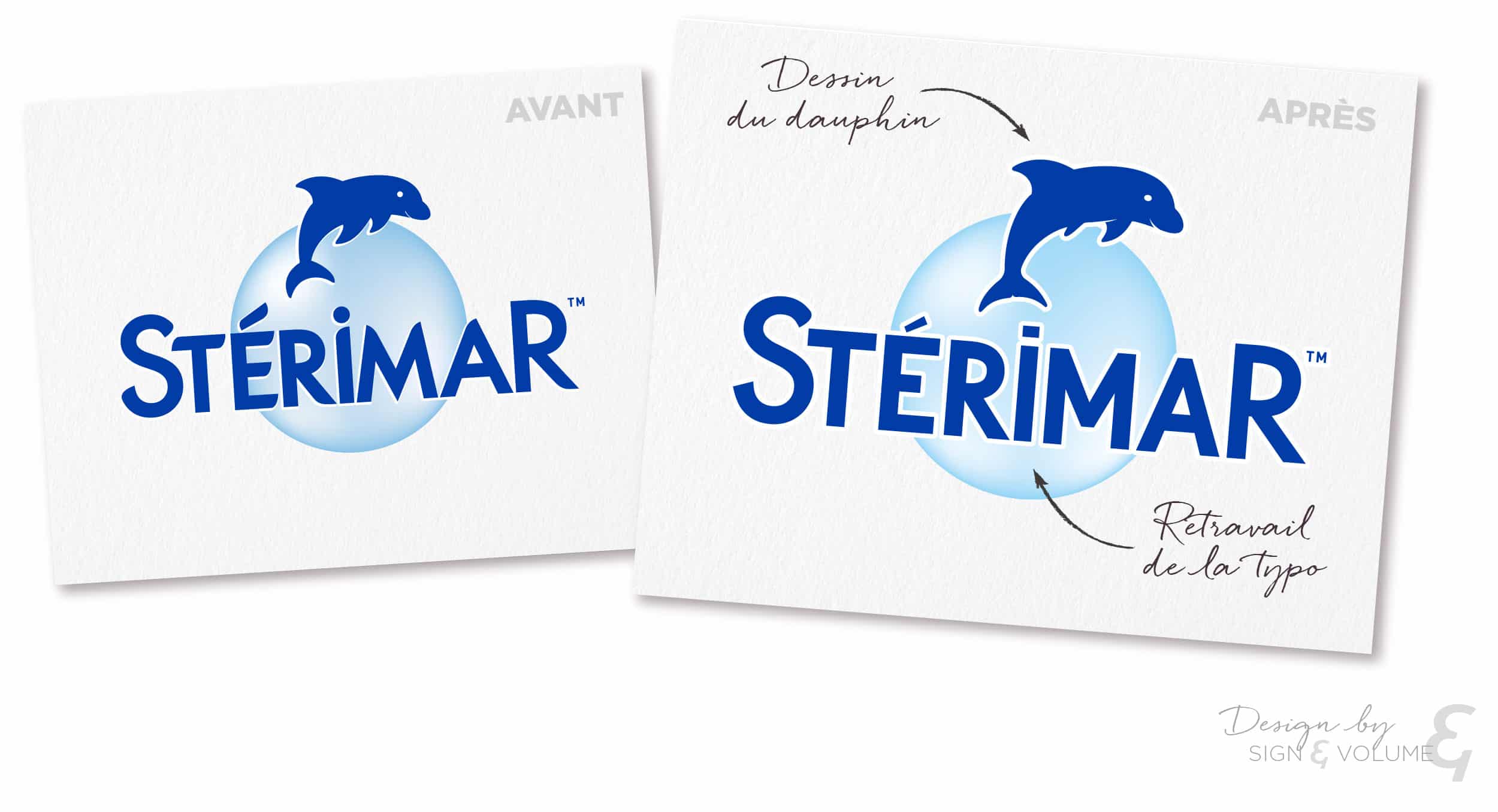
You all know it, you’ve all had it in your bathroom – the little Stérimar dolphin!
How can we give it a new look while preserving its iconic design?
Subtlety is always in the detail. We’ve kept the whole structure of the logo and adjusted a few elements. The typeface, with its roundness, needed to be reworked, so we restructured it to make it more modern and give it more poise. However, we kept the larger S and R so as not to disrupt the overall perception of the logo. The dolphin has also been given a facelift; its features are more assertive and closer to the actual proportions of the bottlenose dolphin, but it retains its mischievous look. The blue sphere still forms the background.


How to change a packaging that’s already firmly established in its market?
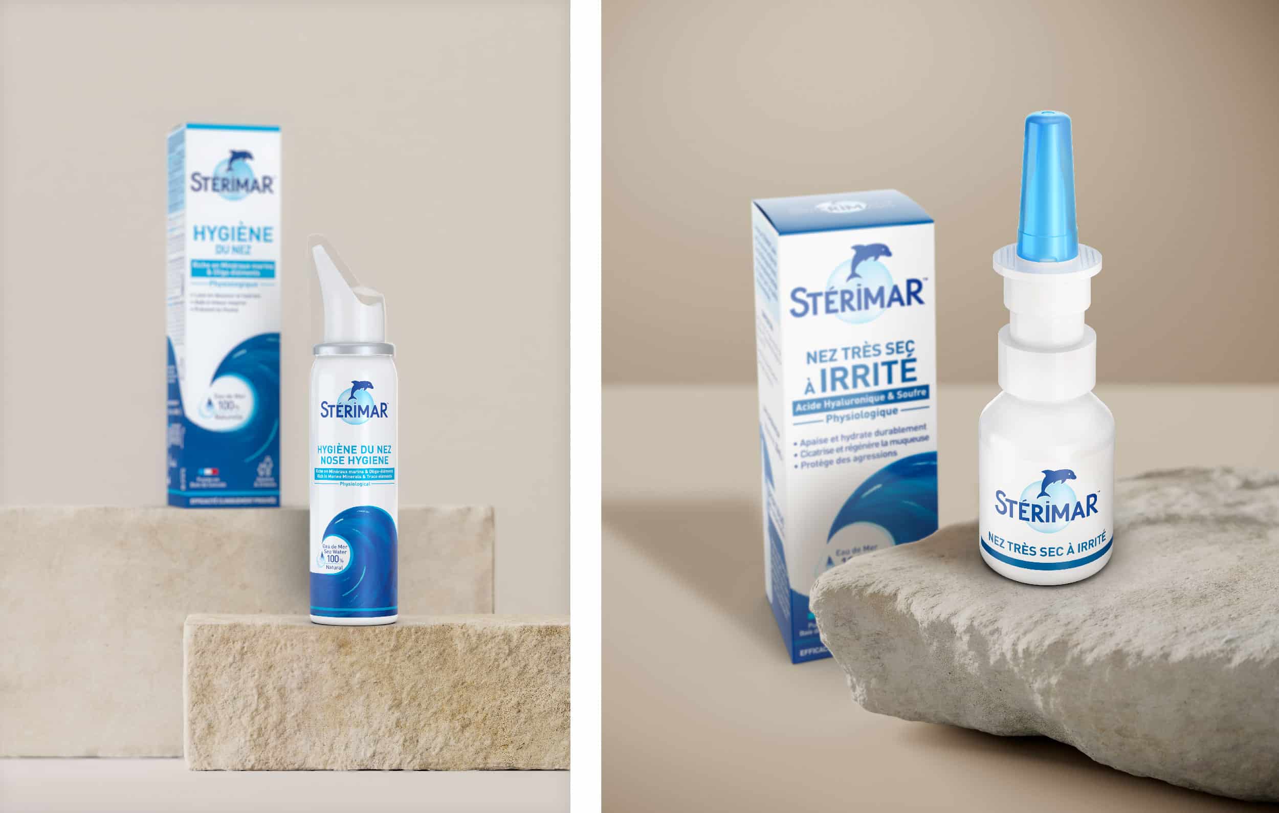
The redesign of the Stérimar range took place on 2 levels. The first challenge was to clarify and simplify the architecture of the range to make it easier for customers to understand. We decided to divide the products into 4 families classified by colour. Within each family, we distinguished the products in a monochrome representing the intensity of the symptoms to be treated. In this way, consumers can clearly identify the product according to their needs.
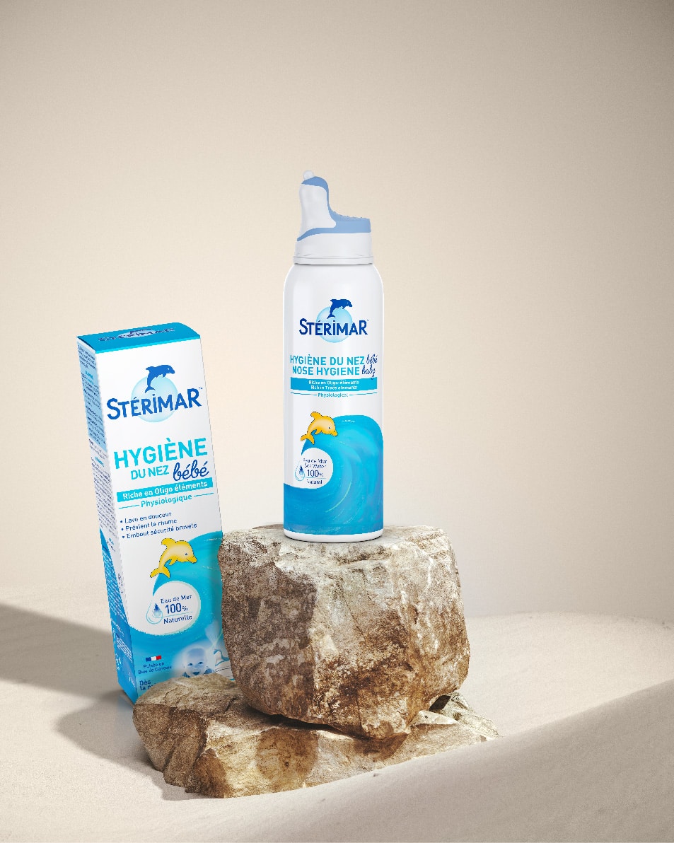
The second challenge was to make the product pack look more natural without completely changing it, because consumers are already familiar with it. We therefore decided to keep the visual architecture of the pack unchanged, so that customers would always be able to recognise it at a glance on the shelf. We then added a modern, natural touch to the existing design.
Firstly, the visibility of the product name has been increased, accentuating product identification and on-shelf segmentation. The colour palette of the segments has been composed so that it remains close to the shades already used by the brand, while moving towards more natural, soft and contemporary colours. The iconic wave has retained its original shape, but has been given naturalness through subtle graphic work. At its heart, we’ve added the words “100% natural seawater”, a key feature of Stérimar spray. Finally, at the bottom of the pack, we’ve added reassurance elements such as dosage and French origins.
Sales tools to promote the design evolution
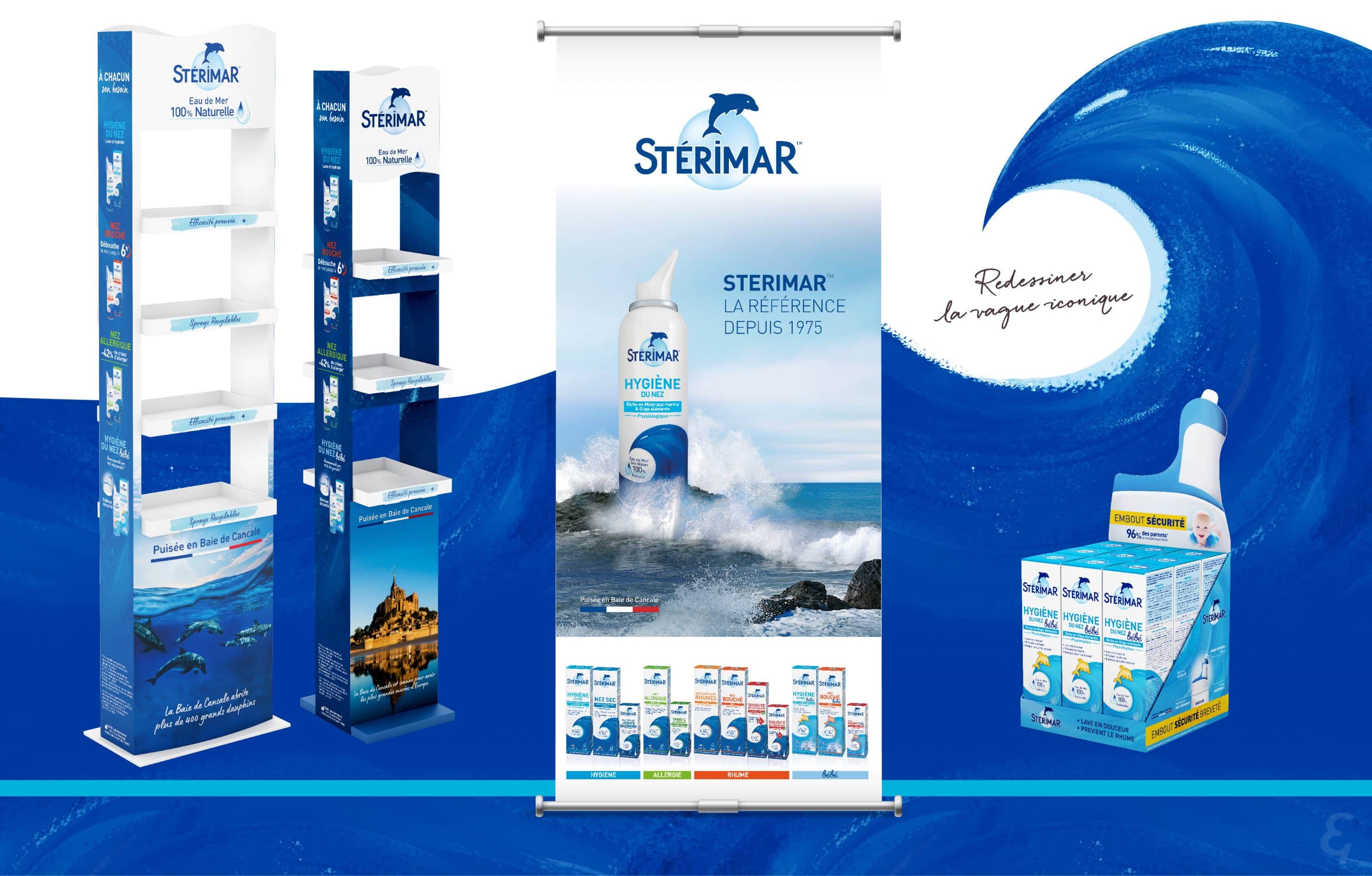
Once our work on the brand’s visual identity and the overhaul of the product range is complete, it’s time to promote all these new products!
To present and explain the new look to the sales force, we produced a reveal video unveiling the range’s new design. And to support the products and their new design at points of sale, we worked with Stérimar to come up with all the essential sales tools: Kakemono, posters, point-of-sale displays, etc.

// Color research
// Graphic proposals
// Packaging development
// Promotional tools creation
// 3D modeling
You have a question?
feel free to ask!
