phyto 3000 brand identity
visual identity
Restoring the prestige of Phytotherapy
Laboratoire Phyto 3000 wants to enhance its expertise in herbal medicine and botany by giving its Phytotherapy brand a more premium image. Their range of products has been firmly established in the pharmaceutical world for over 30 years, thanks to formulas inspired by traditional Chinese medicine and adapted to Western culture.
Our guiding principle is to create a visual identity that embodies the very essence of phytotherapy: symbiosis with Nature. We aim to strike a harmonious balance between Science and Nature, between the pharmaceutical world and holistic medicine.
By conveying an image imbued with quality and professionalism, we aim to reinforce the brand’s credibility in order to build solid trust among its target audiences.

Inspiration from the world of apothecaries and herbalistsm
When a brand consider such a significant transformation of its identity, we always begin with a vast phase of visual research, immersing ourselves in the world in which it evolves. We immerse ourselves in its world and its codes, seeking to convey as accurately as possible what it hopes to communicate to the rest of the world.
What does traditional medicine evoke? What images spring spontaneously to mind? What ideas are associated with it?
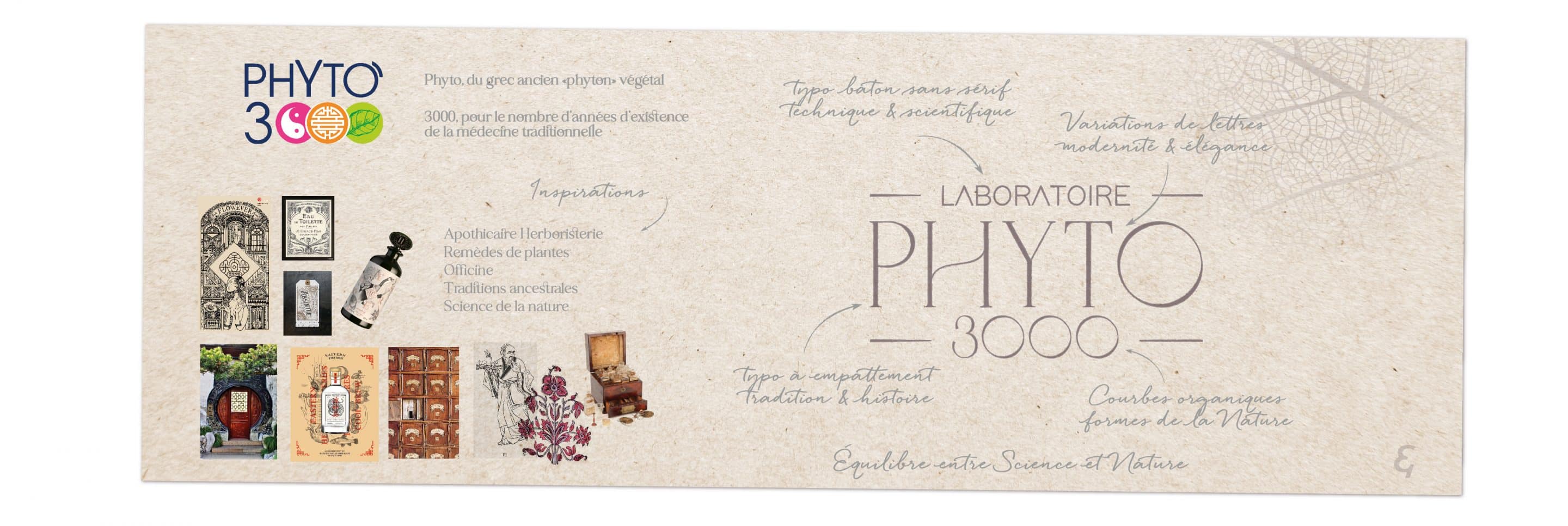
Traditional Chinese medicine and the apothecaries of the past share the same knowledge: the use of the plants power to soothe the pains of the human body. Just as apothecaries evolved into the pharmacies we know today, traditional Chinese medicine has preserved an aesthetic inherited from the past. So we draw heavily on the visual inspirations of this ancient world of concocted herbs, remedies and hand-labelled vials.

Adding the semantics to the logo
Originally, the Phyto 3000 logo used the codes of Chinese medicine and 3 strong symbols to form the “3 zeros” of 3000. The typography retained a very 80s-90s design that lacked structure and presence. The Y escaped from the word Phyto, while a sort of apostrophe crowned the O, upsetting the visual balance.
In our current approach, we are taking a radically different route to evoke the world of phytotherapy in a subtle and elegant way.
What was missing from the Laboratory’s identity was precisely its core business: plants, Nature and the notion of heritage.
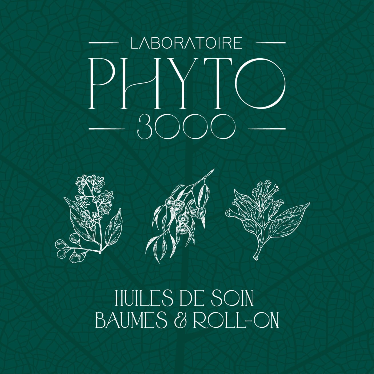
So we put all the strength and power of the product back at the heart of its identity with engraved drawings of plants, a tribute to the age-old representations of botanists.
Our approach is based on a harmonious fusion of natural ingredients and high-end aesthetics, finely blending delicate plant engravings with elegant typography and organic curves.
The word ‘Phyto’ has been reworked in a typeface that evokes the past and heritage, but with a resolutely modern edge.
A // Benchmark
B // Iconographic research
C // Moodboard
D // Illustrations of the universe
E // Color palet composition
F // Typographic research
You have a question?
feel free to ask!
